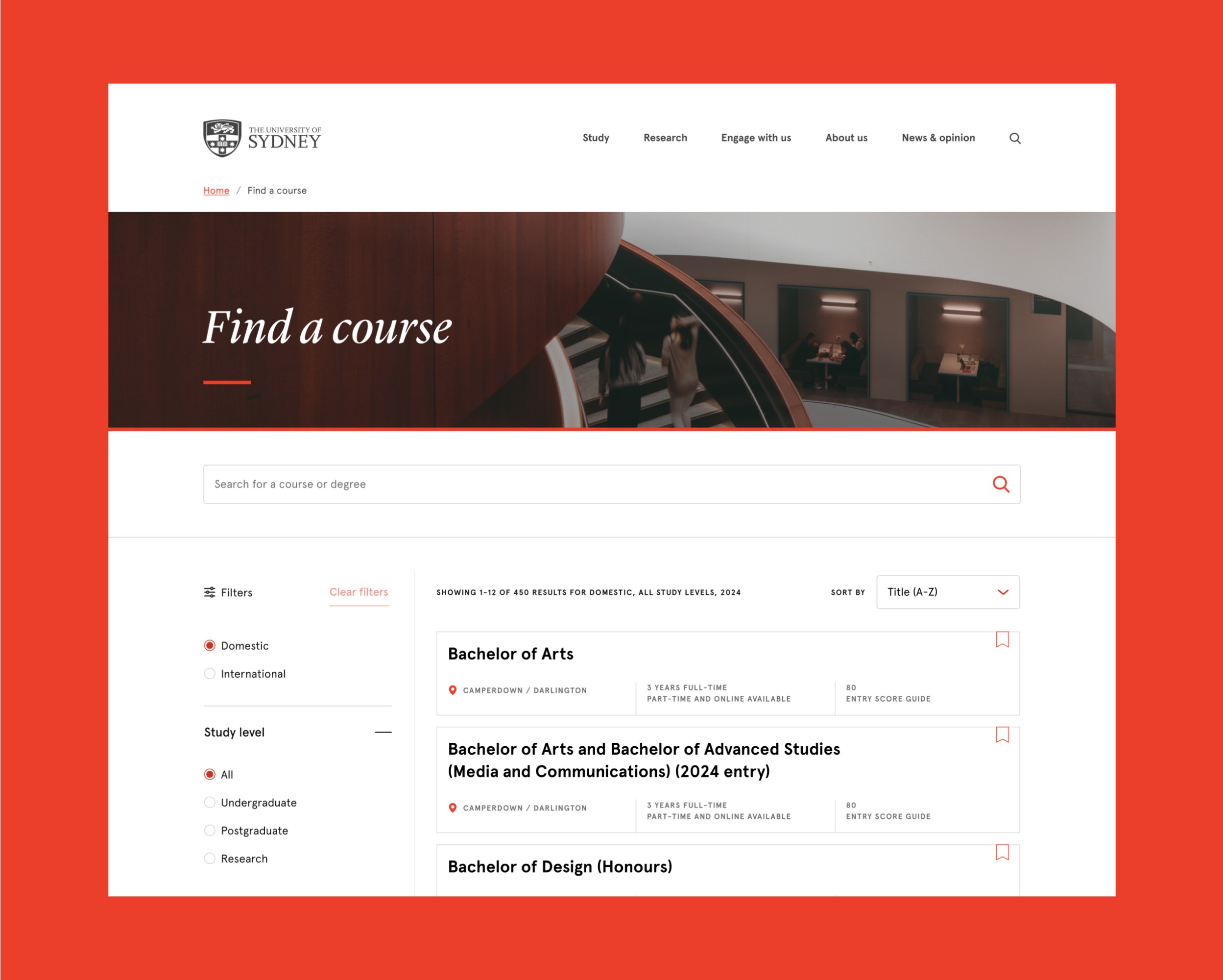
Shortly after introducing a new iteration of the course search page, significant usability issues emerged. Prospective students struggled to find courses effectively, leading to frustration.
Recognising the need for a more intuitive design, the project scope expanded to a complete overhaul of the course search experience. This overhaul aimed to address usability issues, enhance existing features, design new ones, and create more intuitive navigation.
team
• UX Designer
• Product Owner
• Digital Content Producer
• Business Analyst
• Web Developer/s
Impact
• Search clickthrough 68% increase year-over-year
• 26% reduced user error feedback
• CSAT improvement by
• Increased filter feature usage (12% > 56%)
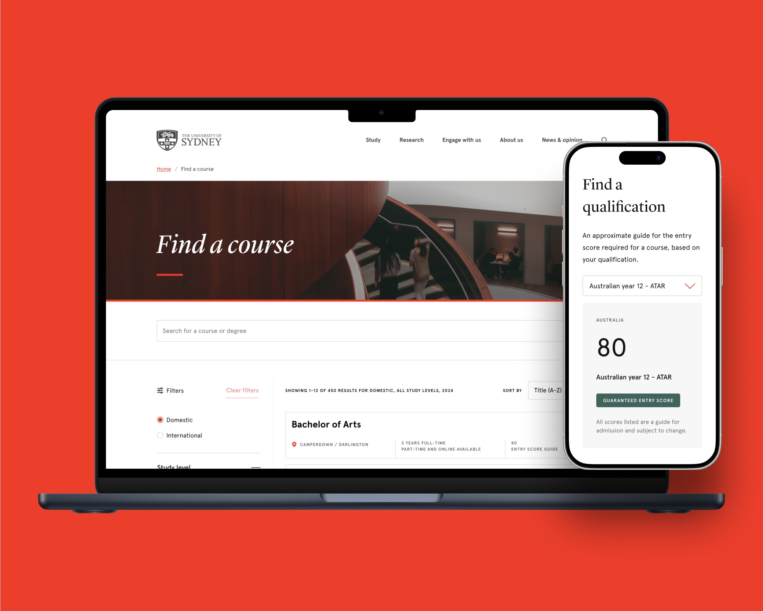
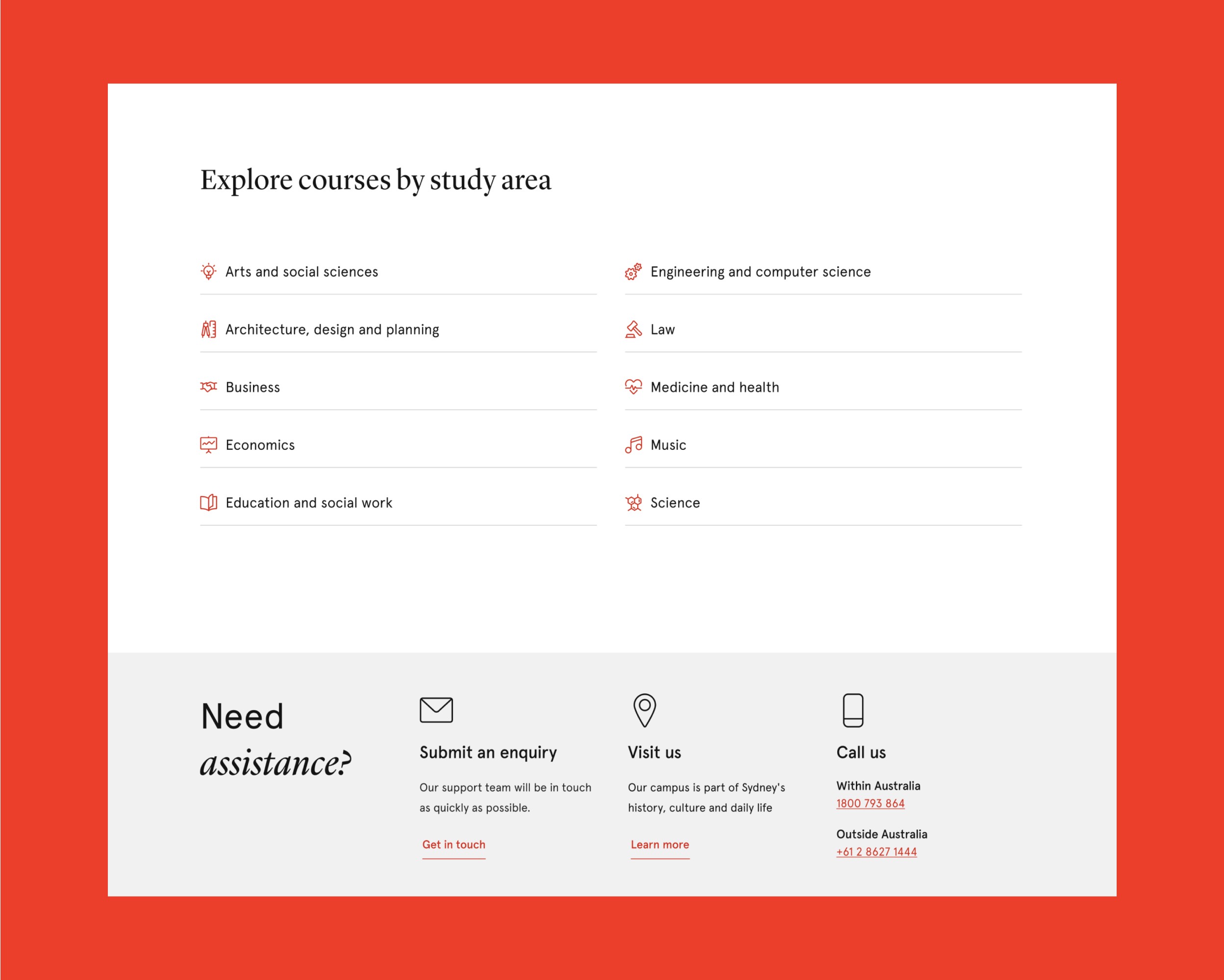
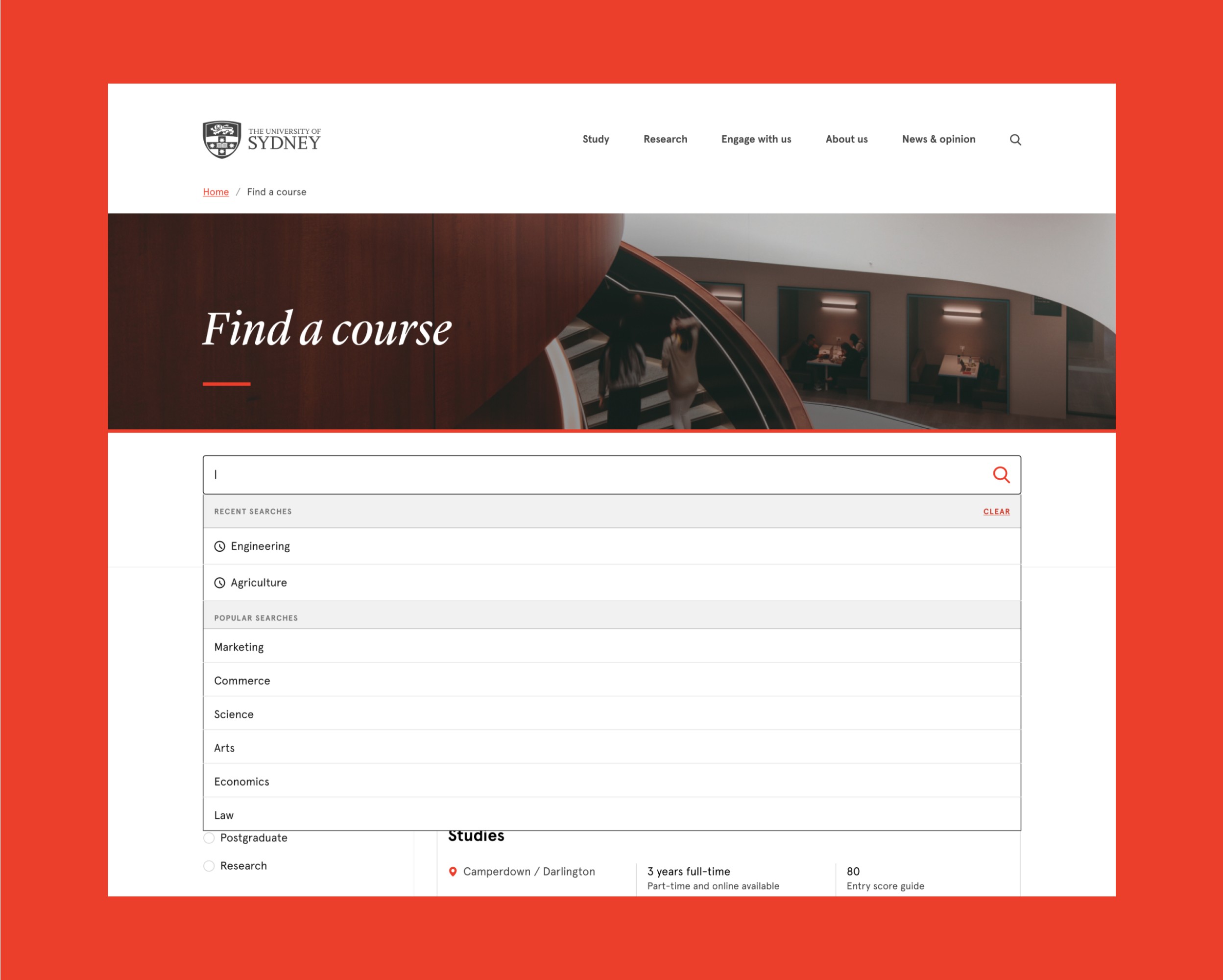
Prospective students were facing several usability issues and bugs in the new iteration of the Sydney University courses search experience, hindering their ability to effectively search, discover, and explore courses with ease. This negatively impacted the user experience and potentially led to losing prospective students.
Design goals

Discoverability
Provide better visibility on recipes and more ways for users to search, discover and explore.

Engagement
Improve overall engagement by introducing new layers of interaction and depth of content on the homepage.
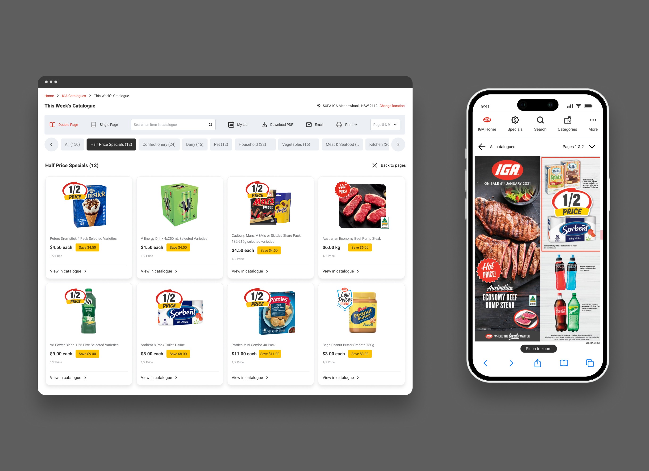
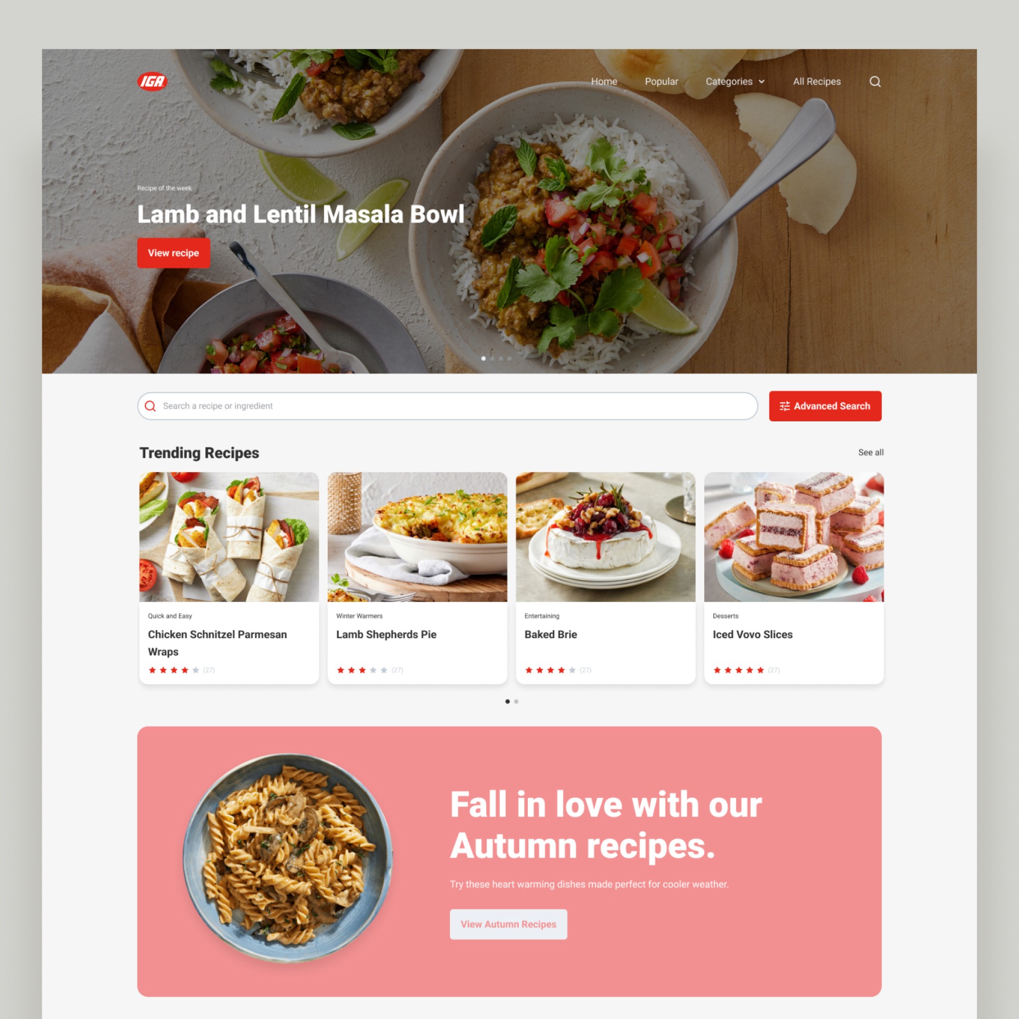
To address the issues related to discoverability, we proposed enhancing the depth of content on the homepage.
With the objective of improving our bounce rate through enhanced discoverability, we redesigned the homepage to include better visibility on our range of recipes, highlighting the most popular based on views and interactions, as well as featuring different categories to promote seasonal ingredients.
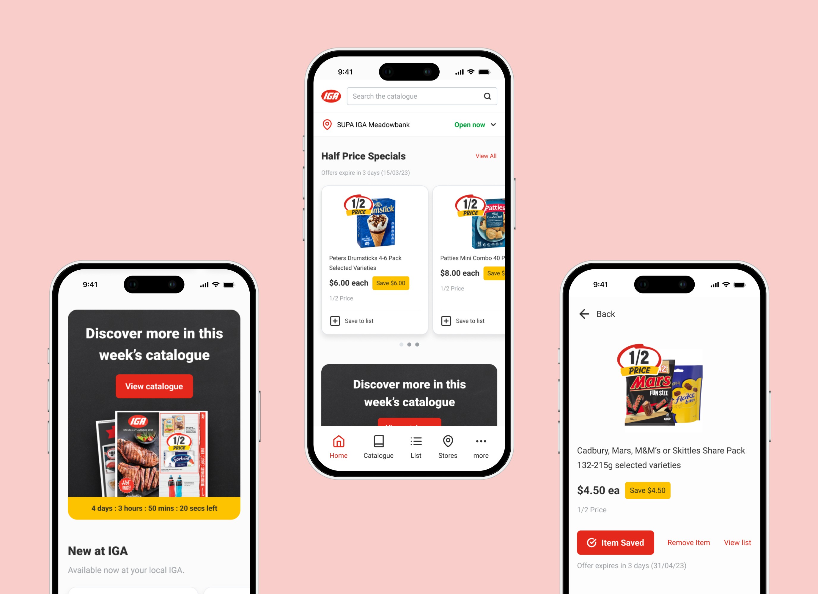
The second important update focused on improving the search experience. Recognising that the search bar was heavily utilised, we decided to enhance it by providing suggested results as users type, aiming to assist them in making faster decisions.
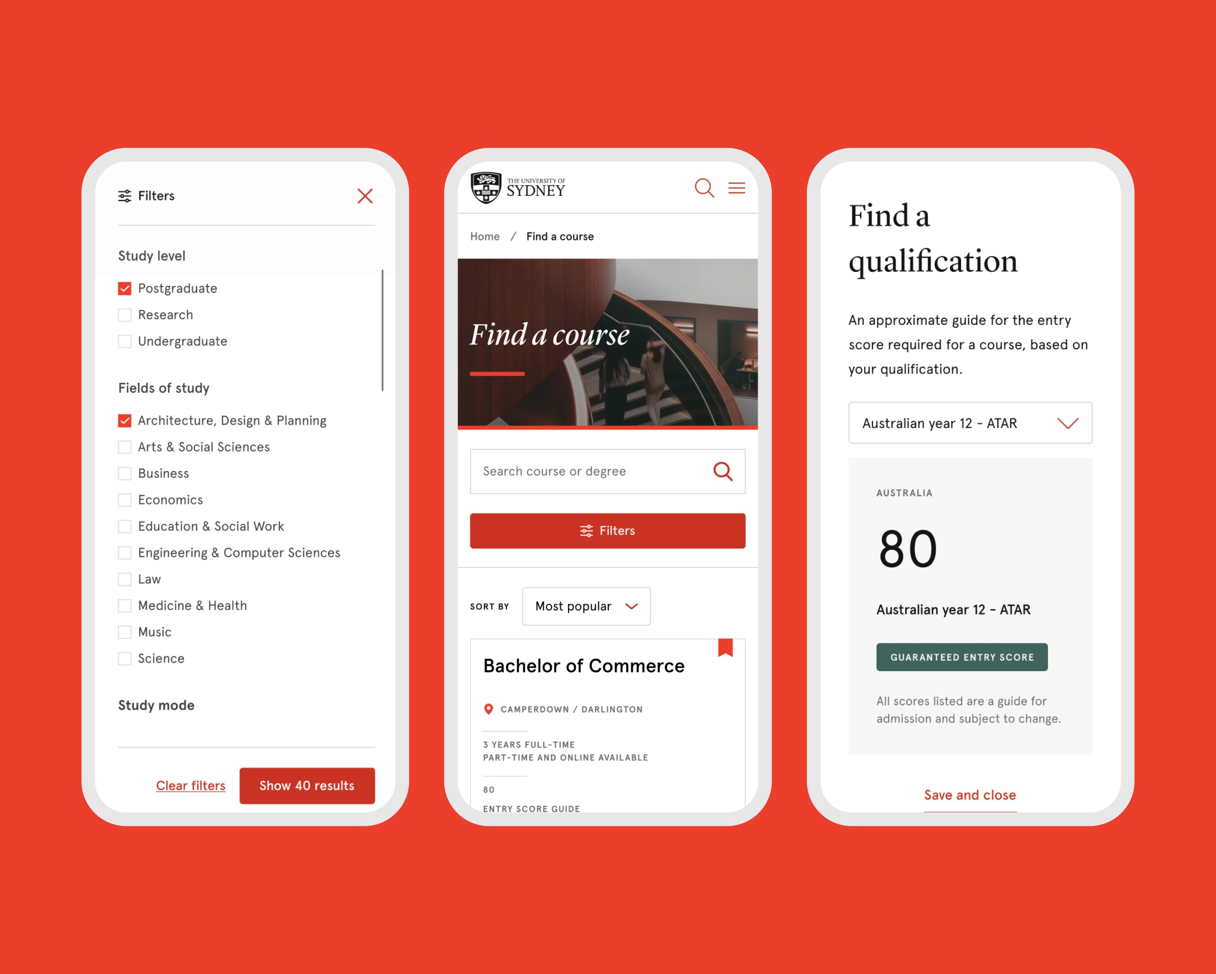
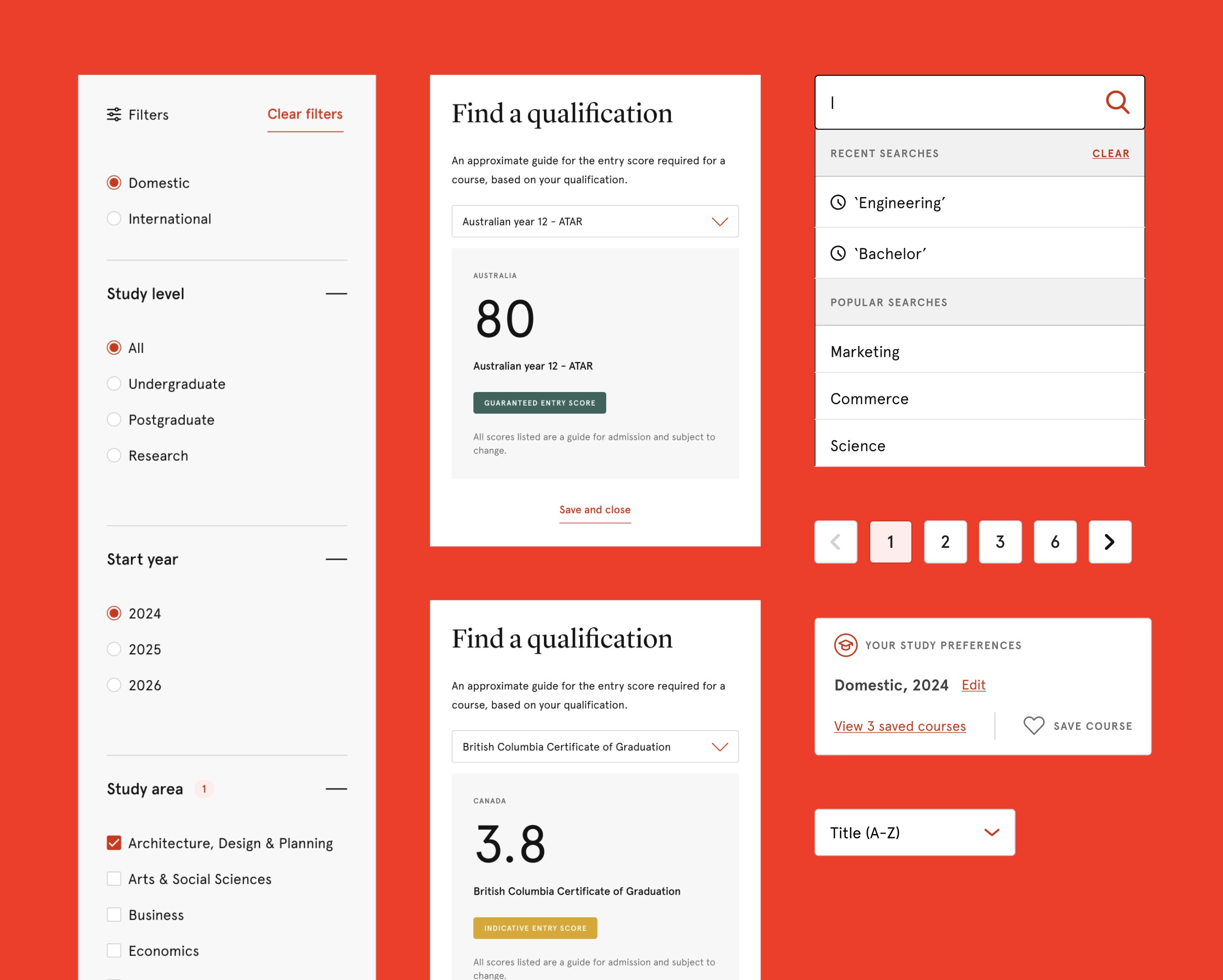
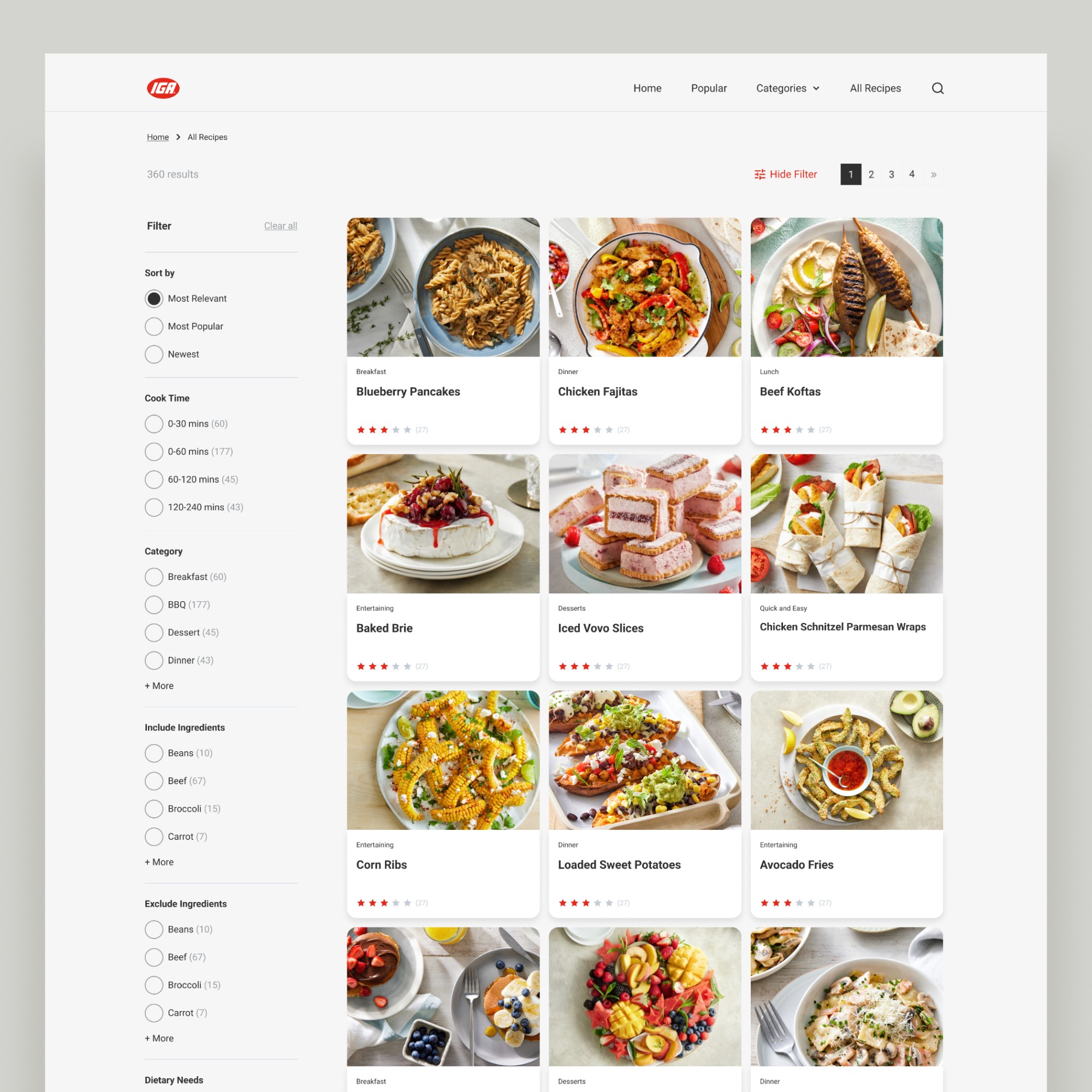
We also introduced an advanced search button that directs users to a new search filter experience. This provides users with more control over discovering and exploring recipes that are tailored to their needs and preferences.
This includes the ability for users to refine their search results based on cook time, category, dietary needs, and a requested feature from stakeholders: the ability to include or exclude specific ingredients.
To address the second key focus area of engagement with recipes, we introduced several interactive features. These features include allowing users to rate and review recipes, share or download their favourites, and add reminders to their calendar for shopping or cooking specific recipes.

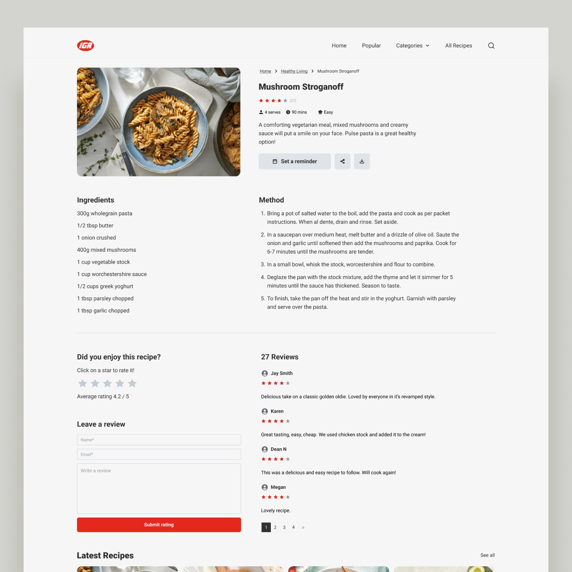
These features not only enhance user interaction with the recipes, but they also provide the business with more ways to measure user engagement.
Outcomes
As a result of our efforts, within 6 months of implementation we saw the performance of the IGA Recipe website significantly improve.
• Reduced bounce rate by 21%
• Increased pages per session by 8%
• High feature interaction and adoption
• Page views on recipes improved
• Improved user feedback score
In summary, these design decisions helped improve overall discoverability and engagement of the IGA recipes website, ultimately leading to a positive reception from the business who used the uplift in performance as an example of IGA shoppers' growing affinity with the brand.